A coffee brand for the people who work the hours nobody else wants. Built from the name up: identity, packaging, a Shopify store, a loyalty time card, a Halloween takeover, social and merch.
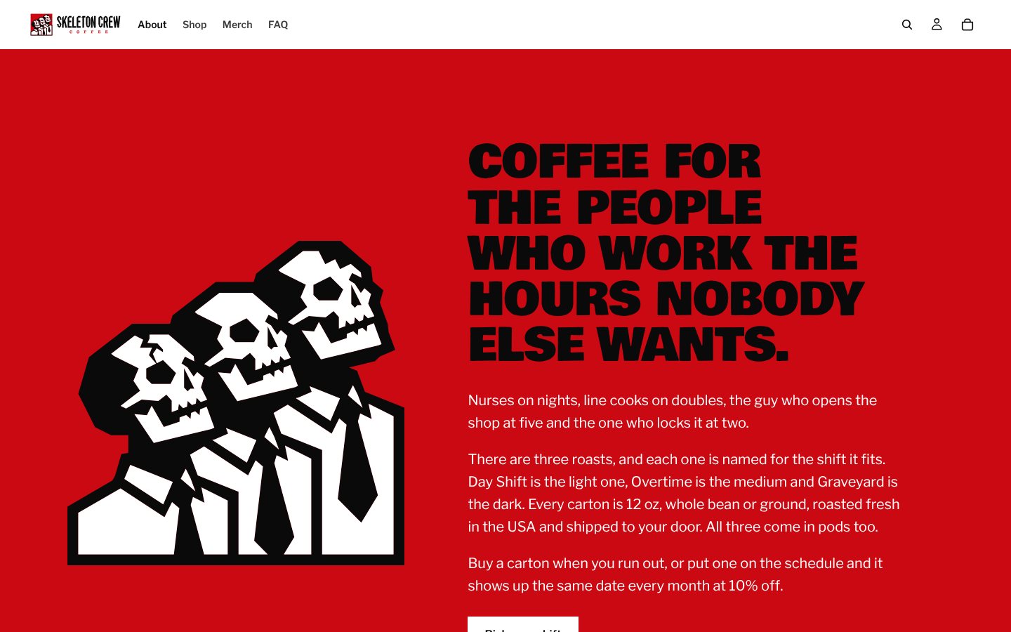
Skeleton Crew is coffee for the people who work the hours nobody else wants. Nurses on nights, line cooks on doubles, the guy who opens the shop at five and the one who locks it at two. The brand talks like them: dry, tired, a little funny, and honest about what the coffee is.
Strong coffee usually sells danger. Skulls, lightning bolts, a promise it will wreck you. I flipped it. Three skeletons in suits who clock in every day anyway. The joke is the job, not the caffeine.
The strong-coffee shelf all looks the same: a black bag, a skull and a promise that it will wreck you. None of it talks to the person actually drinking it at 3 AM.
People working nights and doubles don’t need to be told they’re tough. They need coffee that shows up on time and a brand that gets the joke.
And a new brand gets one look. If the carton, the site and the feed don’t feel like the same company, nobody gives it a second one.
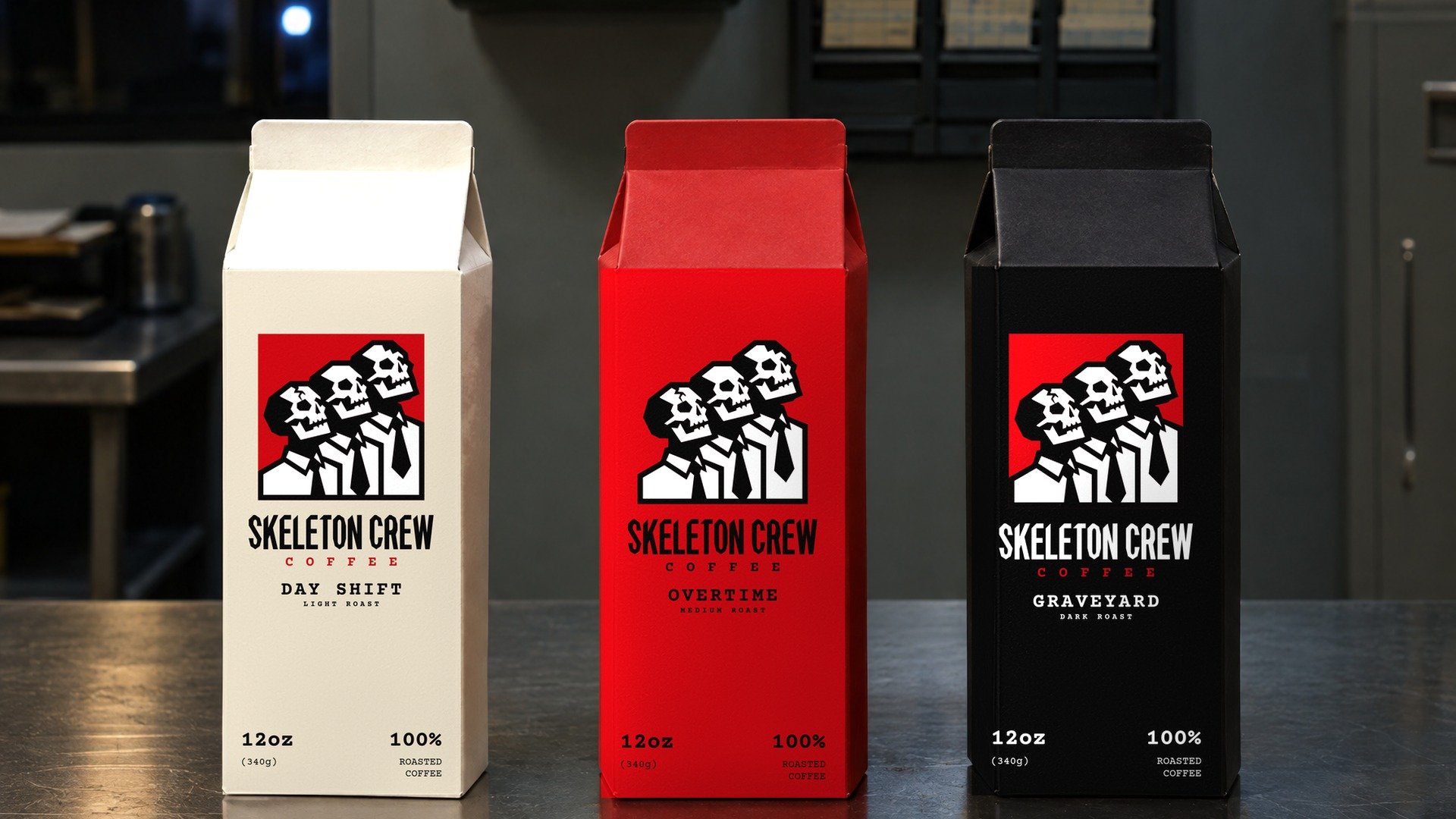
The identity. Three skeletons in suits and ties, shoulder to shoulder like a staff photo. The wordmark is custom lettering and never gets typed out. Courier Prime does the paperwork: labels, memos and roast notes.
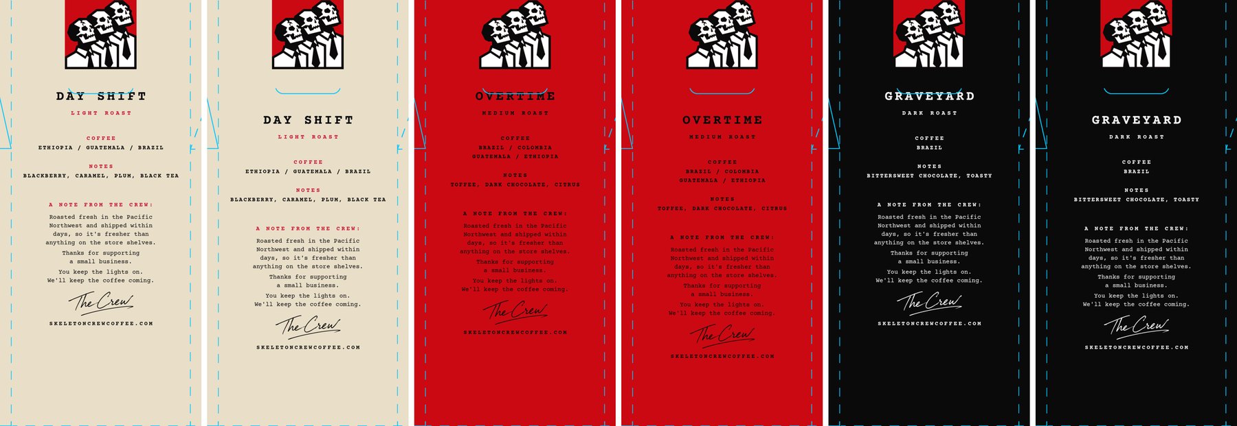
The packaging. Each roast gets its own carton: cream for Day Shift, Crew Red for Overtime, black for Graveyard. The back panel carries a note from the crew, a brew guide and the coffee in plain words. Every mockup places the real logo files with the box’s own perspective and shading, so the mark on screen is the mark that prints.
The store. A custom Shopify theme built on Horizon with its own sections. The homepage opens on a live office that follows the visitor’s clock: daylight from 7 to 4, after hours at night, ceiling lights that flicker, and a skeleton in a suit who walks in, sets his mug down, types for a while and leaves.
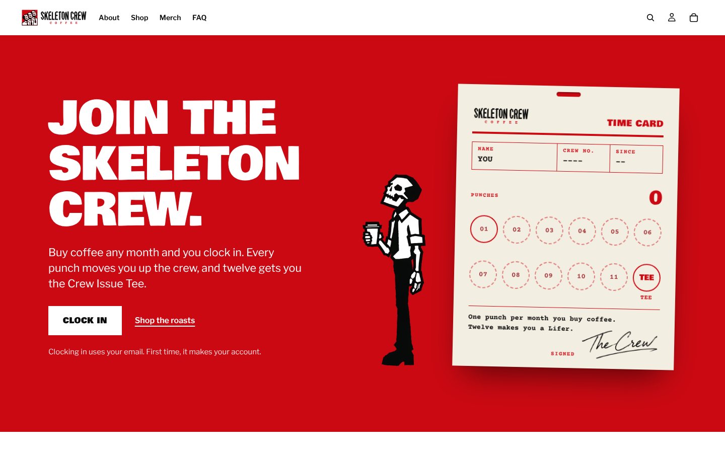
The loyalty program. A time card instead of points. Any coffee order in a month earns a punch, twelve punches earn the Crew Issue Tee, and the ranks go New Hire, Regular, Shift Lead, Night Manager, Lifer. The Schedule puts coffee on a monthly delivery at 10% off.
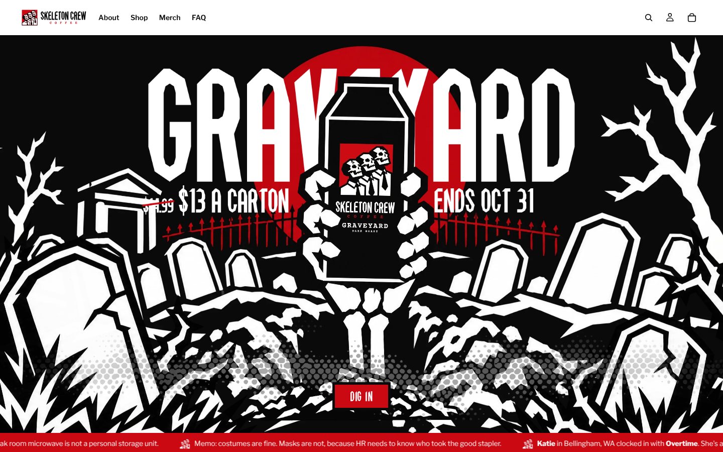
The campaign. In October a graveyard takes over the homepage. The header switches itself by date, from the tease to the sale to last call to the final night, and on November 1 it gets out of the way on its own.
The tuck slot that ate the copy. On the printer’s template for the 12 oz carton, the die line for the tuck slot ran straight through the back-panel text. Every line of the back panel moved down 140 pixels on all three roasts before anything printed.
A bag that was really a carton. The 12 oz ships in a carton and the pods ship in a box, but the early copy called everything a bag. People notice when the words don’t match the thing in their hands, so the site, the product pages and the captions now say carton or box, and the Halloween header was re-lettered to match.
A mascot that stuttered. Crew Guy’s first walk cycle looked choppy, and it wasn’t the screen recording. A third of the frames were repeats. Cutting the duplicates and closing the loop on the same frame he started on fixed it.
A ghost mug. The day and night heroes are stacked layers, and the night mug was showing through the soft edges of the day art as a faint halo. Hiding the night layer in day mode and cleaning the halo out of the day art fixed it.
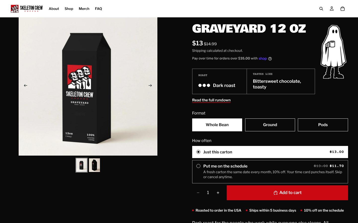
The hero is a live scene that follows the visitor’s clock. From 7 to 4 it’s daylight. After that the city goes dark, the ceiling lights flicker, and the night shift comes in. Every so often a skeleton in a suit walks in, sets his mug down, types for a while and heads out. The room never moves, and the cartons stay sharp in front of him.
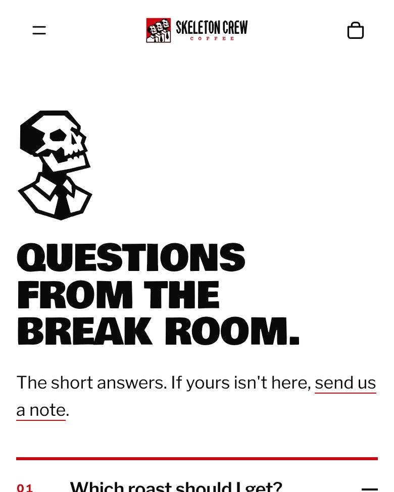
Crew Guy is the brand’s one employee. He walks in above every “Clock in,” talks you through the FAQ, falls asleep in an empty cart and clocks out on the 404. He was built as a full character set, with a turnaround, a run of heads and poses, and walk and sip loops for the pages where he moves.


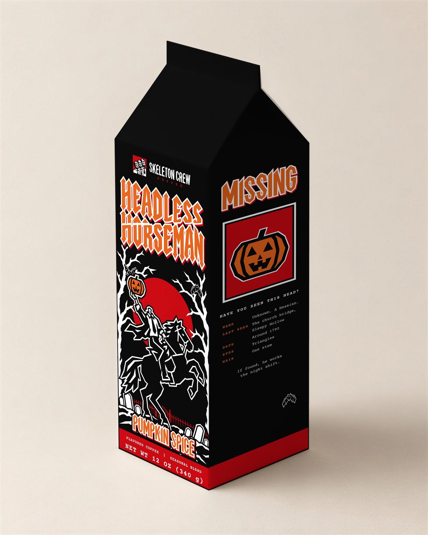
A pumpkin spice carton for October with its own art and its own product page. The front is the rider under a red moon. The side panel is the joke: the headless guy, pumpkin under his arm, punching in on a time clock. It sits next to the three year-round roasts without breaking the system. Same wordmark, same paperwork type, same carton.
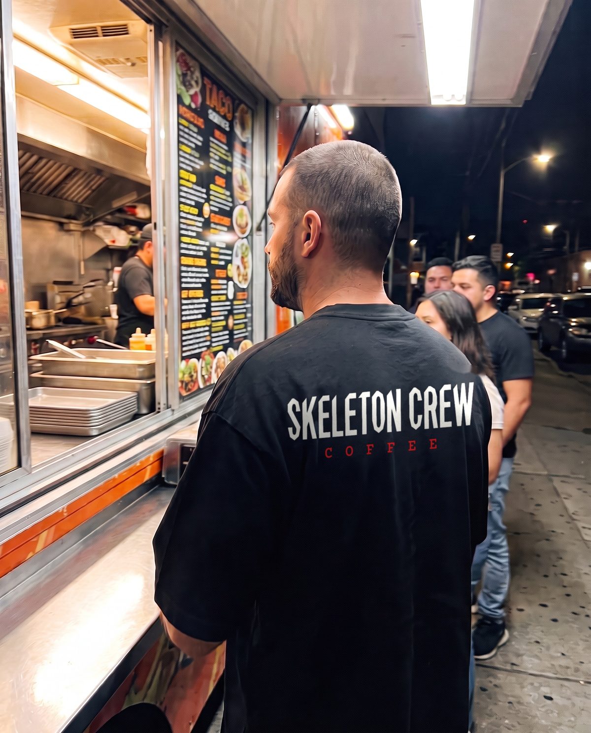
A heavyweight tee, a hoodie with a woven patch and a beanie, made for the walk out to the car at 4 AM. The crew badge sits on the chest and the wordmark runs across the back. The tee is also the loyalty reward. Twelve punches on the time card and it’s yours.
This is the most complete brand I’ve built: a name, a voice, packaging, a store, a loyalty program, a campaign and a merch line, all in the same tone. The time card, the 404 page, the back of the carton and a memo about bats in the break room all sound like the same tired coworker.
Most of it comes down to small rules kept every time. Red is a full field. The wordmark is never typed. A carton is a carton. Keep enough of those and people know the brand before they read the name.